

Our clients for this project are established weekend residents who purchased the site’s existing home with plans to retire in St. Helena.
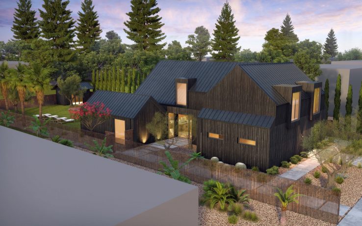
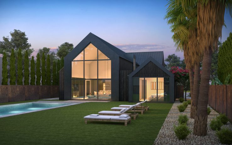
The new design adds a family room, exercise room, guest bedroom and guest bath to the existing three-bedroom, two-bath home – a modest expansion that will have an outsized impact on the home’s livability for this family. Moving the garage from the side to the front of the house, tucked into the home’s ground-floor footprint, allowed us to create a private entry at the side of the house, accessed through a small entry courtyard. Large dormers draw light into the interior, and allow our clients’ two young daughters to engage in the life of the street below.
Color, materials and architectural details all serve to minimize the scale of the two-story structure. The traditional barn vernacular speaks to the agricultural context of the upper Napa Valley. Shou sugi ban siding and standing seam metal roof are sustainable material choices that acknowledge and address the region’s vulnerability to fire. The use of shou sugi ban – a charred wood finish that is traditional in Japan, also responds to our clients affinity for the aesthetic of traditional Japanese design. The dark color helps diminish the home’s visual scale. A continuous datum line on the exterior, which visually defines the transition from ground floor to the upper floor, also mitigates the sense of scale: siding planks are larger below the dadum line and narrower above. To expand the home’s usable space, while respecting the set-backs to each side and the existing scale and design of the rear yard, we shifted the home forward on the lot – closer to the street – bringing it in line with its neighbors and the rhythm of the street.